Creating the Badger Brand
The quirky origins of the UW’s world-famous logos
It’s hard to imagine the University of Wisconsin–Madison without Bucky Badger, or athletics’ Motion W, or the academic W Crest. There’s also that seal with a creepy eye and the Latin-ish phrase “Numen Lumen.” (Where did that thing come from?) These logos are everywhere: stitched on jerseys and hats, plastered on buildings and signs, printed on diplomas and consumer products, and tattooed — sometimes permanently — on Wisconsin sports fanatics.
How did they become so ubiquitous? According to Tricia Nolan, the UW’s assistant vice chancellor for marketing and brand strategy, they serve as visual shorthand for the university, conveying strong feelings of pride and nostalgia. “People are here at pivotal points in their lives,” she says. “They form a relationship with the university. All that gets packed into a brand — that powerful emotional response people feel when they hear or see the words the University of Wisconsin–Madison.”
While these logos are now recognizable symbols of a global brand, their eccentric origins will surprise even the most die-hard Badgers.
Will the Real Bucky Badger Please Stand Up?
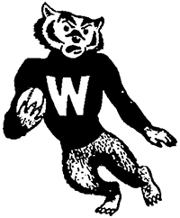
The Bucky Badger we know and love today — marching with purpose, puffing his chest, clenching his fists, sporting a striped sweater, and flashing his signature scowl — was born on a bookshelf. And he easily could have died there in obscurity, a mere cutout on a novelty decal sheet competing with other illustrated badger mascots.
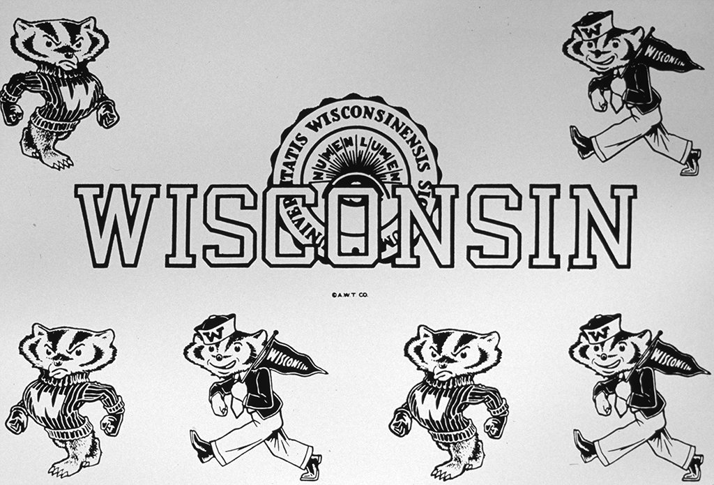
Bucky Badger’s debut on a 1940 sheet of “comic collegiate badger mascots.” UW Archives
In 1940, Brown’s Book Store on the corner of State and Lake commissioned a sheet of “comic collegiate badger mascots” from the Anson W. Thompson Company in Los Angeles. Artist Arthur Evans drew a pair of parading badgers, the belligerent one that would later emerge as Bucky and a friendlier counterpart carrying a Wisconsin pennant and wearing a freshman beanie (which made him look more like a sailor than a student). Standing a badger upright with humanlike features marked a significant evolution for the mascot, as the UW’s earliest renderings opted for a realistic profile of the four-legged mammal. Two other Madison bookstores sold decal sheets with similarly humanized (but markedly unsettling) mascots. Fortunately, none of those stuck.
Decal sheets with early, unsettling versions of the mascot.
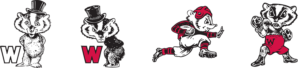
The UW athletics department first used Evans’s version in the 1948 Football Facts and Centennial Sports Review publication. That same year, it started to appear on official news releases and letterhead. Although briefly competing with UW artist Bill Schafer’s “black-sweatered badger” — carrying a football in a stiff-arm pose with a nearly identical face — Evans’s badger emerged as the one true mascot.


The evolution of Bucky Badger.
Alliteration enthusiasts were already calling it Buddy, Bernie, Bobby, or Bouncy. But the badger lacked an official name until a rigged competition in 1949.
That year’s Homecoming pep rally committee, led by chair William Sachse ’50, sought to make a splash by reintroducing a live mascot and holding a naming contest. The occasional practice of keeping a real, captive badger on the football sidelines as a mascot had ended in 1947 after one reportedly got loose and bit a cheerleader.
“He was so antisocial,” Sachse later told the Wisconsin State Journal. “Once you dragged him out … he’d immediately start burying into the turf on the field to hide. That was the badger’s disposition, and we couldn’t change that.”
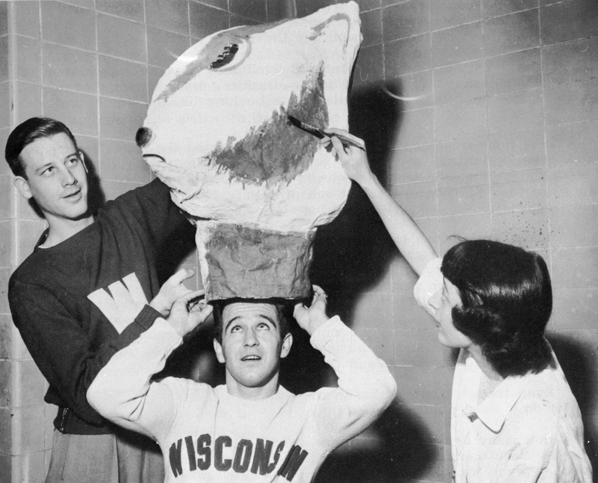
The next year, students jokingly replaced the badger with a raccoon — or, as they cleverly called it, “a badger in a raccoon coat” named Regdab (“Badger” spelled backward). The 1949 Homecoming committee wanted to bring back the badger, but this time in human form. Art student Carolyn Conrard Gesell ’50 sculpted a serviceable though asymmetrical badger head out of papier-mâché for cheerleader William Sagal ’51. A costumed badger was ready to roam the UW football team’s sidelines for the first time.
The Daily Cardinal announced the naming contest that would apply to both the humanized mascot and logo. It received minimal interest, and by the time the call for entries closed, the Homecoming committee had already decided to advance their own: “Bucky,” short for “Buckingham U. Badger.” The students drew partial inspiration from Buckingham Palace, which had been in the news because of the upcoming Festival of Britain. The “U” doubled in meaning as “You” and “University.”
The earliest version of the Bucky Badger mascot head. UW Archives
Both Bucky the logo and the mascot suit have been modernized over the years. In 2003, the logo received a digital makeover with trimmed fur, clean lines, and a higher-resolution look. Bucky also got a fresh sweater. A block W that had decorated it for decades was replaced by a logo surging in popularity: the Motion W.
Putting the W in Motion
If Barry Alvarez is the face of the modern era of Badger athletics, then the Motion W is the symbol of it. They both arrived at the UW in the early 1990s, which is why the legendary football coach is often credited with the creation of the logo that has evolved into the global brand marker of the university. But that distinction actually belongs to a graphic designer who was working at the Madison-based Rayovac Corporation.
Yes, a battery company.
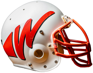
A rejected version of the Motion W had its tryout on a football helmet. Bryce Richter
Ric Suchanek, who was the senior creative artist at Rayovac, remembers being pulled out of a battery marketing meeting by company owner Tom Pyle MBA’63. Pyle disliked the UW’s existing football helmet logo, a generic block W that started to carry the stigma of a losing program. With the arrival of a fresh regime in Alvarez and Athletic Director Pat Richter ’64, JD’71, he saw an opportunity and presented it to Suchanek: “If I get you some helmets, and I get us an audience, would you mind doing some designs?”
With blank helmets as his canvas, Suchanek got to work. He sketched designs with pencil and marker and attached vinyl decals. His favorite design was a funky, italic W that looked like it was dancing off the helmet and featured a wraparound element. He presented it along with several others.
“It was the coldest cold call that I’ve ever made,” Suchanek says. “I walked in with a big box of helmets, and when I got done with my presentation, it was dead silent in the room. I was like, ‘Oh, no.’ Then Pat Richter spoke up and said, ‘We don’t think that you’re quite there. But would you keep working on it?’ ”
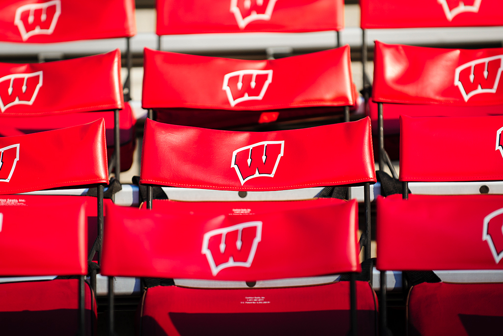
The Motion W has evolved into the global brand marker of UW–Madison. Bryce Richter
Alvarez liked the energy of the early designs but thought the more dramatic ones belonged in the Pac-10, not the Big Ten. After more than 20 designs, Suchanek landed on a compromise that everyone loved: a hefty red W, turned askew, with sharp, playful curves and a trailing black shadow. Behold, the Motion W.
“I wanted something that was forceful, bold, and strong,” Suchanek says. “I wanted something that looked like the program was moving forward.”


The old block W and a dynamic Motion W.
With just weeks to go before the start of the 1991 football season, the athletics department rushed to produce the new helmets for the opening game. The logo gained wide recognition following the UW’s three Rose Bowl appearances that decade. Originally designed for only the football helmet, the Motion W was quickly promoted to represent every athletics team.
For his artistic efforts, Suchanek received an autographed football helmet, a custom jersey with his name on it, and a contract signing over all his legal rights to the logo. Later, with the Motion W evolving into the foundation of the entire athletics brand, he received two football season tickets for the life of the logo.
“I would have liked to have had a penny for every time that they use the W,” he says, laughing. “But I enjoy going to the games.”
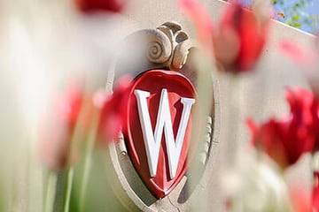
A Mysterious Seal
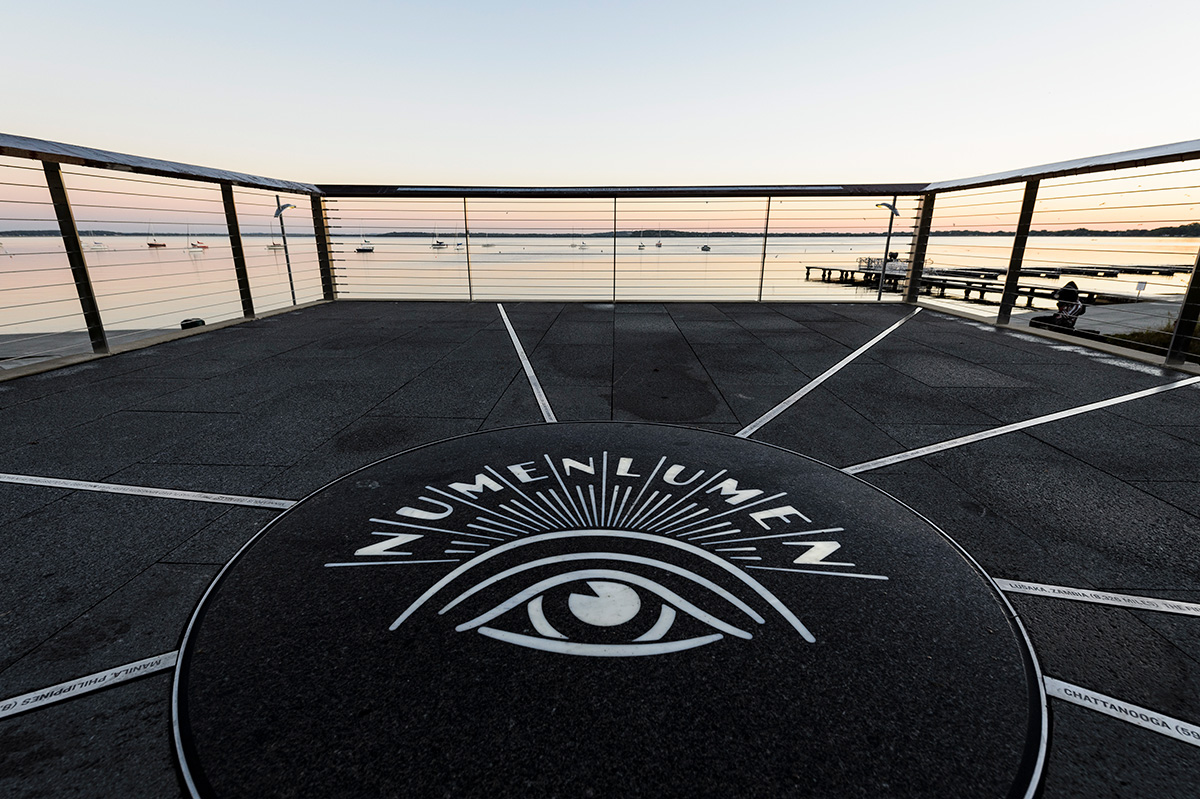
A version of the Numen Lumen in Alumni Park. Jeff Miller
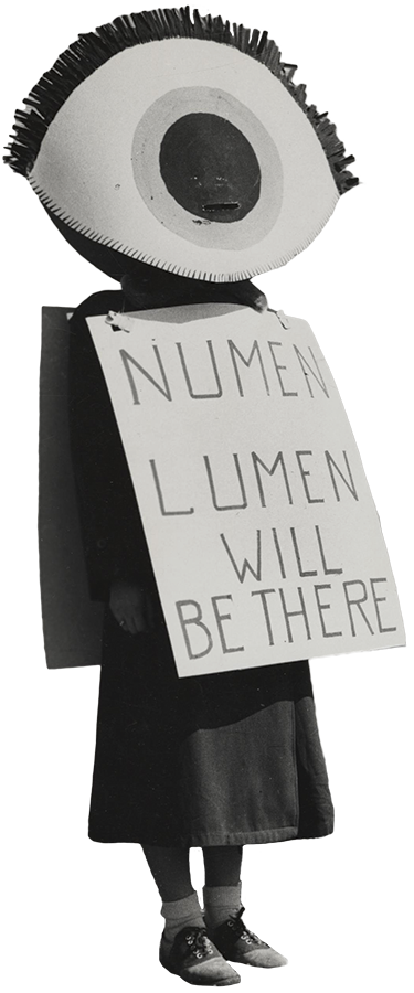
A 1951 costume-ball promotion for the UW International Club. UW Archives
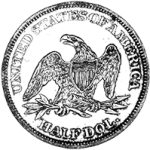
At their very first meeting in October 1848, the UW’s Board of Regents appointed a committee to develop an official seal for the university. Surprise: the committee failed to deliver. As a stopgap in January 1850, the regents copied the back side of the U.S. half dollar — eagle and all — as the UW’s first seal.
On February 11, 1854, UW chancellor John Lathrop finally presented to the board a custom seal that he described as “the human eye, upturned to receive the light falling upon it from above; the motto in illuminated letters above the eye, ‘Numen Lumen’ (God our light).” The seal was executed in Cincinnati under his written instructions, though he expressed mild disappointment at how it had turned out, noting that “justice is not in all respects done to the design.”


Replacing a generic half dollar design, the Numen Lumen has taken many forms.
Lathrop never elaborated on the seal’s meaning or what inspired it, and the letter with his “God our light” translation went missing for nearly a century. This gave the Numen Lumen an air of mystery on campus, with professors proposing various interpretations in the early 20th century. James D. Butler discovered the likely origin of the curious Latin phrase: from the motto of the British noble Earl of Balcarres, “astra castra, numen lumen munimen” (“the stars my camp, God my light and strength”). H. B. Lathrop proposed an even grander translation: “The divine within the Universe, however manifested, is my light.”
Regardless, it seemed clear that the seal’s design — a human eye looking up at an arc of rays (which appear a bit like eyelashes) — represented intellectual enlightenment.
After the UW System formed in the 1970s, UW–Madison held a contest for a new version of the seal to help differentiate the campus. The winner was art professor Philip Hamilton’s modernized Numen Lumen with a minimalist eye encircled by bold, spoke-like rays.
After operating under its watchful eye for 130-some years, UW–Madison retired the Numen Lumen as the official logo in 1987. But versions of it can still be spotted on campus today, including on the grounds of Alumni Park and the floor of Memorial Library.
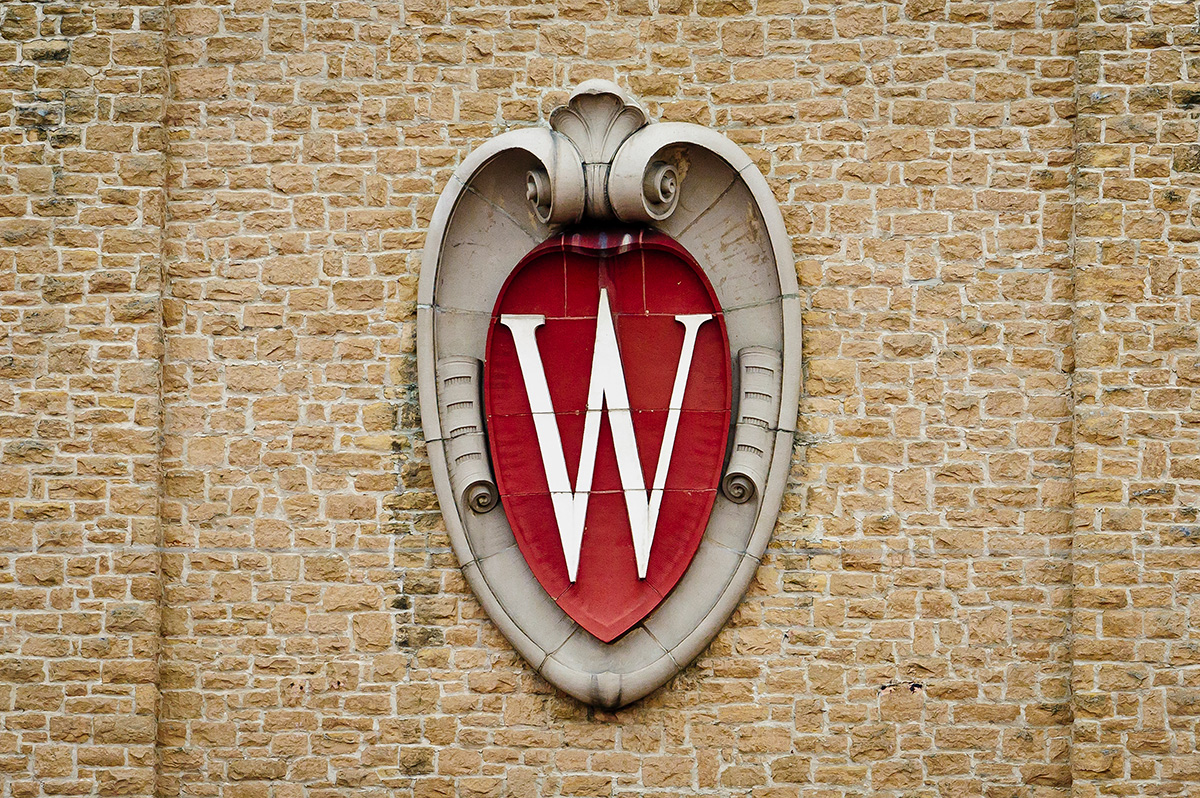
A Crest Fit for a Golf Shirt
You might think that the W Crest — UW–Madison’s current academic logo — was created to look good on a college diploma. And it certainly does, with its regal design that resembles the shield in a coat of arms. But in fact, it was created to look good on a golf shirt.
The W Crest was inspired during a chance sighting of the elegant architectural element on the Field House. Bryce Richter
In the late 1980s, the School of Medicine and Public Health was in the market for a new logo. Dean Philip Farrell wanted something classic and distinct from the clichéd medical symbols of most peer schools. He tasked Earl Madden MFA’82, the art director of the UW’s publications office, with designing a logo fit for a formal golf outing.
Madden had no idea what that meant, but he happened to be attending a football game at Camp Randall when he noticed the elegant architectural element on the exterior of the Field House.
“It’s halftime, it’s like 40 to nothing, and I’m just bored and looking around,” he says. “I said to my wife, ‘Do you have a pen?’ I opened to a blank page of the program and drew the crest from the Field House. I said, ‘This is it!’ ”
Madden returned to photograph the crest before drawing it by hand and capturing every flourish. To give the flat drawing an illusion of three-dimensional depth, he used a shading technique called stippling — drawing dots in increasing and decreasing density. Before the days of digital design software, it took him two weeks to render the crest to his satisfaction.
Farrell was blown away. Ironically, so was the University Ridge Golf Course, which grabbed the crest logo for its own use.

The logo represents “the history, tradition, and distinctiveness of our university.”
In 2001, at Madden’s urging, UW–Madison elevated the crest to its official academic logo. The crest design was paired with a “Wisconsin” wordmark in Friz Quadrata — a serif font you may recognize from Law & Order — that has become equally iconic.
“[It’s] a logo that represents the history, tradition, and distinctiveness of our university,” Chancellor John Wiley MS’65, PhD’68 wrote at the time.
The W Crest can now be found on seemingly every corner of campus, decorating Bascom Hill’s banners, Alumni Park’s water feature, and Witte Hall’s connecting tower.
“When the registrar’s office redid the diplomas with the crest on it, I thought, ‘I can die now.’ It’s been humbling to see its reach,” Madden says.
The logo has been refined and simplified in recent years to render better digitally and at smaller sizes. But it stays true to its architectural inspiration.
No one knows who created the original pair of crests that bookended the Field House’s façade when it opened in 1930. But in a rendering by state architect Arthur Peabody published in the November 1928 alumni magazine, you can spot a thin W engraved on the exterior. It’s almost identical to the W that would come to anchor the crest sculpture — and now, the university at large. •
Preston Schmitt ’14 is a senior staff writer for On Wisconsin.
Published in the Winter 2023 issue
Comments
Toni (Goodman) Friedland November 14, 2023
Loved the history lesson!
Larry Elliott November 19, 2023
Why did the university retire the Numen Lumen in 1987?
Tony Geracie December 8, 2023
I’d be interested to see the other designs that were submitted for the rebranded football helmets in the early 90s…are those even available?
Gerald C Doran March 1, 2024
Bucky wore boxing gloves because Wisconsin had the best college boxing team in the country
TT March 12, 2024
It is too bad the University and Atheltic Department do not support the individuals who bring Bucky to life with scholarships, while they make Athletics an incredible amount of money from their efforts and continue to help make stories like this relevent.
Bob Warshal '63 MS '64 March 13, 2024
Don’t you hate it when you write a comment, are just about done and it disappears?? Well it just happened. Second try….I enjoyed the latest issue of On W. and want to ask regarding Johannes’ letter on the topic. I remember the crest W from the Student Union facade when I was a student in the late 50s no? Yet in ‘Communications’ Jim J refers to his days of discovery in ’83.
I like the ‘crest’ and was happy to find a cap in the Book Store with the crest, though not one of the better hats. What gives on the dates? 1958 vs 1983?