How the Humanities Building Went Wrong
From the start, problems plagued a piece of architecture that could have been great.
The Humanities Building may be UW–Madison’s most controversial structure. Generations of students have called the concrete mass the “Inhumanities Building” or claimed it was built as a riot-proof bunker. It’s so cold that faculty members need layers of office rugs to keep their feet warm. It’s also confusing — a partially connected horizontal labyrinth spanning a city block. When it opened in October 1969, a student got lost and was late to class, establishing a UW rite of passage. “Is this supposed to be some kind of maze?” the student huffily asked a Daily Cardinal reporter.
Current plans call for Humanities’ removal between 2029 and 2030, to be replaced by modern academic buildings. Its problems are noticeable even on a quick walkthrough: degrading concrete, rusting rebar, leaky windows and doors.
But beneath the disrepair lies an extraordinary history. How did such an ambitious project by one of America’s most innovative architects turn into a punch line?
The Architect
By the early 1960s, the UW’s humanities departments were suffering from soaring demands and stagnating resources. As baby boomers arrived on campus, pushing student enrollment projections to 40,000, the programs pleaded for help.
The art department was housed in the Education Building, which proved hazardous for classes with toxic materials. The music school was spread among three campus buildings and five annexes — primarily cramped Music Hall and acoustically challenged Science Hall. The history department’s 75 courses were scattered throughout 24 buildings, with faculty members sharing desks in Bascom Hall.
“The map situation in the department is deplorable,” wrote members of the 1959 History Building Committee. “There are less than two score high schools in the state of Wisconsin which are not more adequately equipped for the study and teaching of history than the University of Wisconsin. We need a building.”
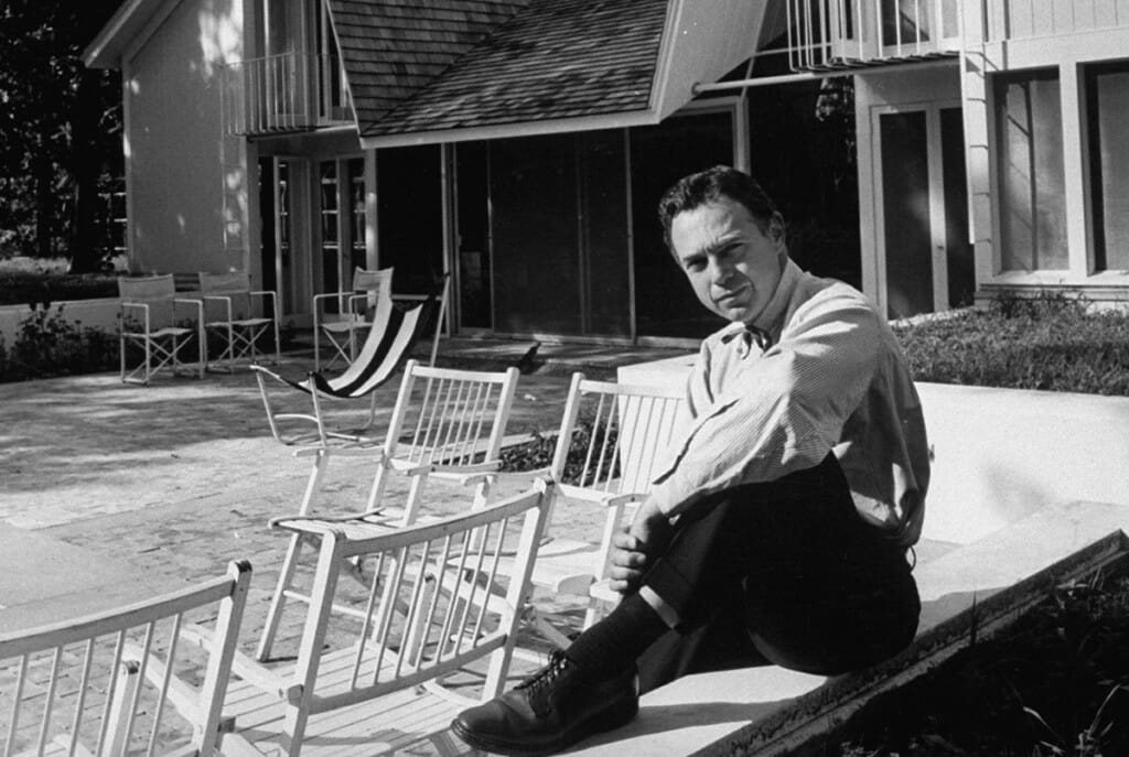
The university obliged, working with the state to find a solution for the art, music, and history programs, as well as a new art center. Taliesin Associated Architects, a group founded by Frank Lloyd Wright x1890 to carry on his work, was among the 15 firms considered for the South Lower Campus Project, but the state awarded the contract to Chicago architect Harry Weese.
The 46-year-old Weese had completed high-profile projects around the world, including a U.S. embassy building in Ghana. Campus planner Gordon Orr considered him one of the country’s top 10 architects.
Ironically, Weese’s most triumphant work coincided with the Humanities Building: his 1960s design of the Washington Metro transit system. In 1998, the New York Times deemed his stations “among the greatest public works of this century,” with concrete vaults that “induce an almost religious sense of awe.” Although sharing a Brutalist design, the Humanities Building has not earned such a designation.
The Vision
The university identified the intersection of Bascom Mall and Park Street as the only viable site for such an ambitious project.
The history department needed access to Memorial Library and the Wisconsin Historical Society; the music school required proximity to existing theaters in Music Hall and the Memorial Union. And since the new complex would include performance spaces and art galleries, the location needed to be accessible to many visitors.
Weese recognized that the site would be a new focal point for the university, where the campus and city coalesced and where foot traffic would be heaviest. He designed the megastructure horizontally, deferring to the height of nearby buildings and preserving the cherished view of the state capitol. “Height control,” Weese wrote in his analysis sketch, “is of vital importance in developing a unified campus.”
His earliest sketches showed attractive landscaping and pathways. But as the UW’s demands grew, the structure’s footprint expanded to nearly the entire lot.
Weese’s daring concept fueled anxieties among the future cohabitants. “We are increasingly concerned about the adequacy of the sound-barriers that will shield us against the racket coming our way from Music,” history chair Irvin Wyllie wrote. “Originally we had assurance that we would hear only ‘finished sound’ from the Concert Hall. Now there is talk of using that hall as an all-day practice facility. We have no desire to hear any ‘unfinished sound’ anywhere in our building.”
The final designs for the seven-story building assuaged most concerns. Weese dedicated the lowest floors to classrooms, practice areas, lecture halls, and performance spaces. He designed exterior entrances for the largest lecture and concert halls to control heavy traffic and separate students from visitors. He split the three middle floors into office spaces for each program. And he assigned the art department the top floors, where the studios and galleries would benefit from “favorable lighting.”
And so the university made way for the 300,000-square-foot building, razing the existing row of apartments. When Humanities opened in 1969 — with the construction bill exceeding $10 million — it became campus’s largest and costliest classroom structure. Weese’s office promoted it as “a congenial integration of learning and performing facilities for students and lovers of the arts alike.”
And on the surface, that may have seemed true.
The Design
Architectural Forum described the new Humanities Building as “one of the most sensitive and inventive pieces of urban design to be found on any U.S. campus,” with precise detailing “reminiscent of the best work being done in Northern Europe.”
Today, you have to know where to look to make sense of such praise.
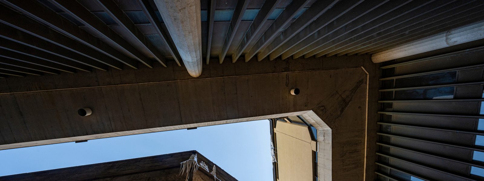
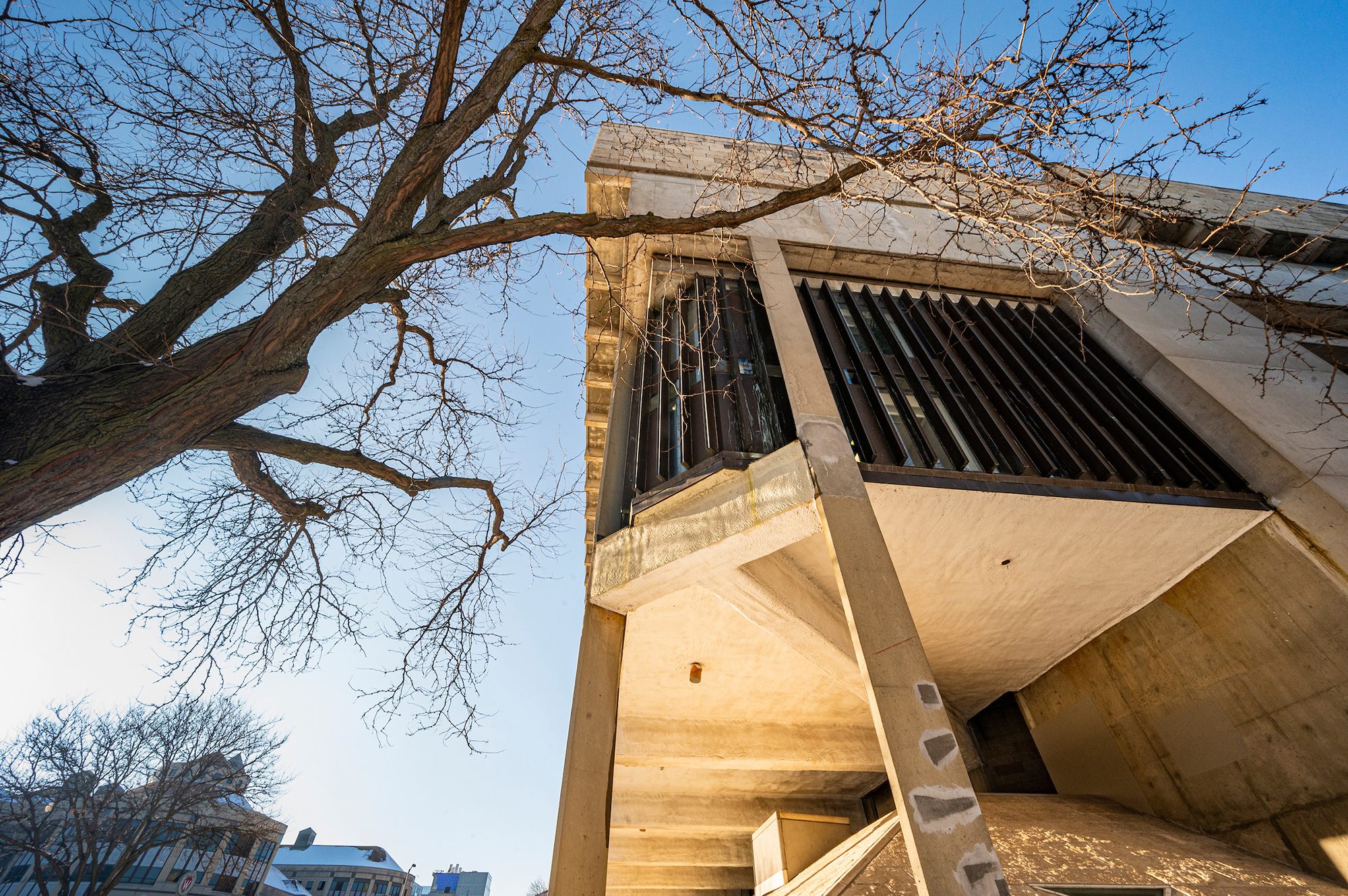
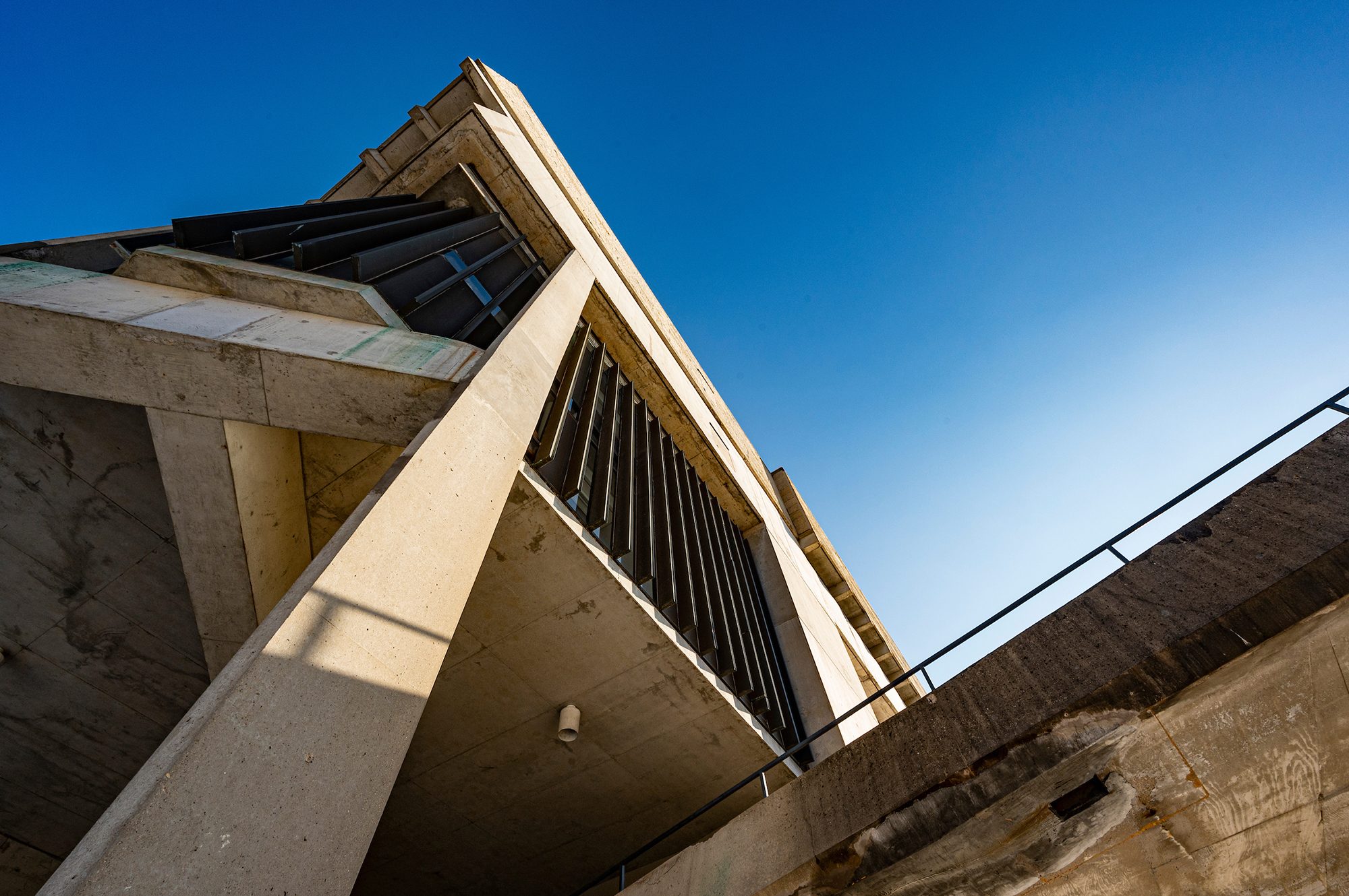
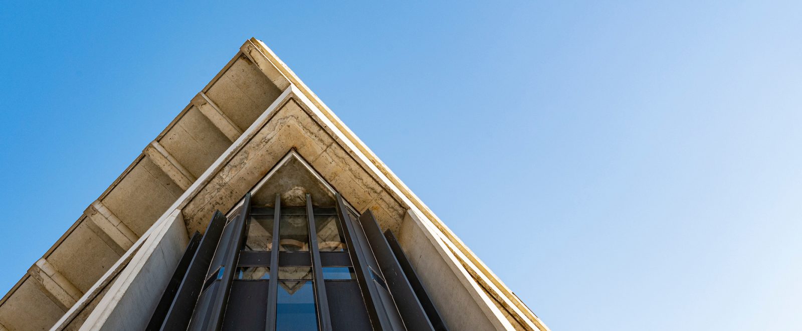
Weese’s three-layer vision starts at the top, with a two-story concrete mass suspended by columns and a cornice line matching the height of the neighboring Wisconsin Historical Society. Visible from Bascom Hill, the jagged roofscape was designed as a “fifth façade,” with ample skylights for the art studios below. Limestone panels cover the upper exterior, the tan color keyed to the sandstone found on Bascom Hill’s oldest buildings. Matching campus’s existing cornice line and signature colors “signifies both humility and respect,” Isthmus critic Kent Williams wrote in 2005.
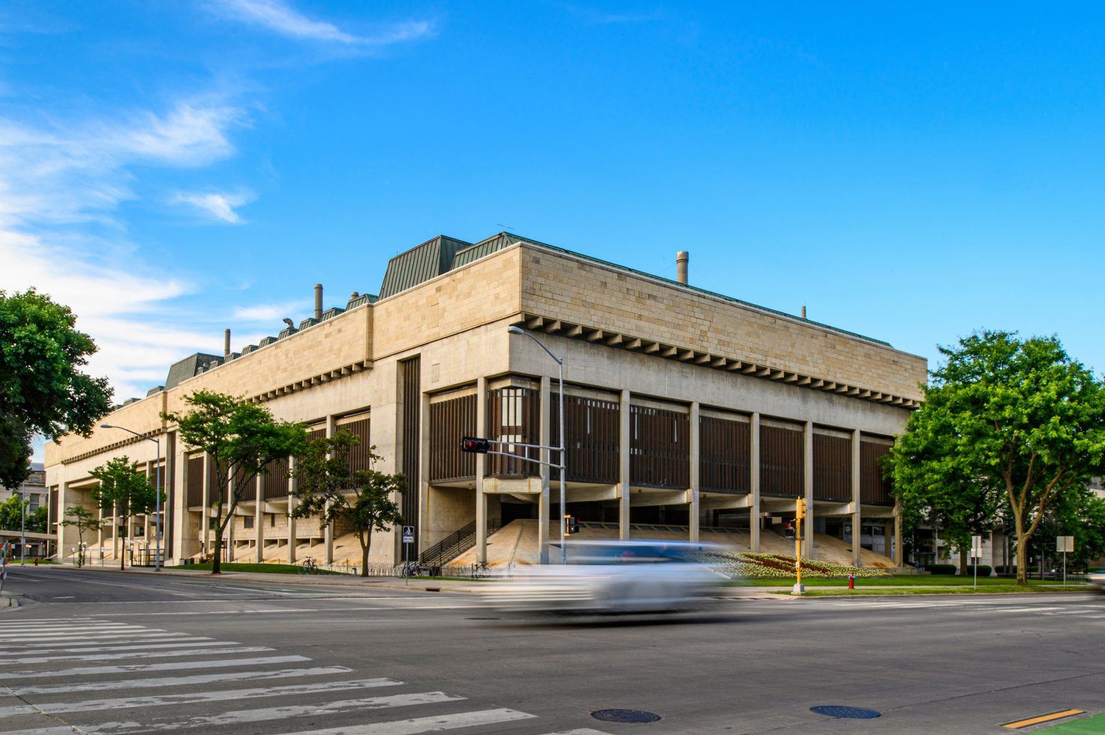
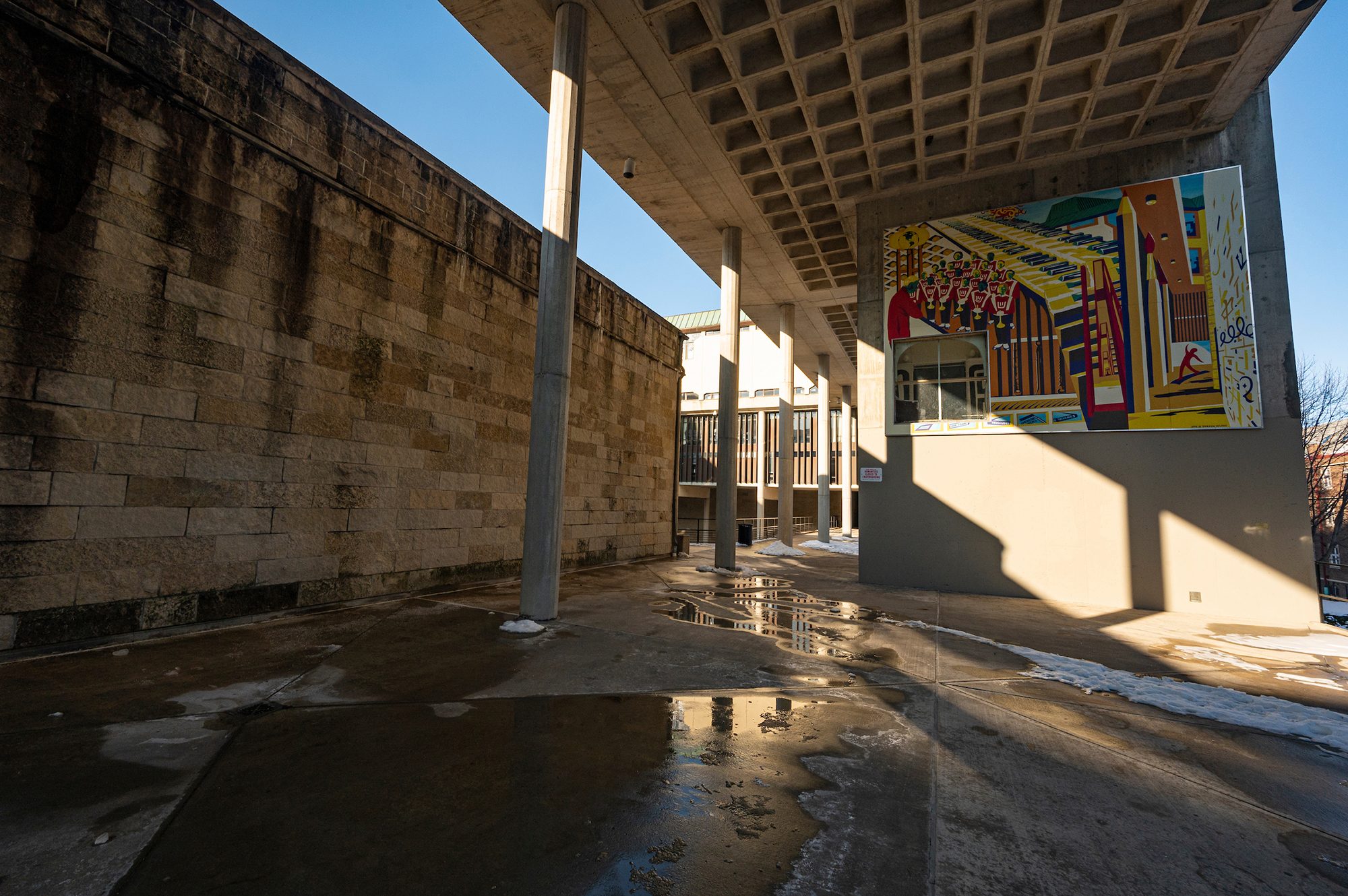
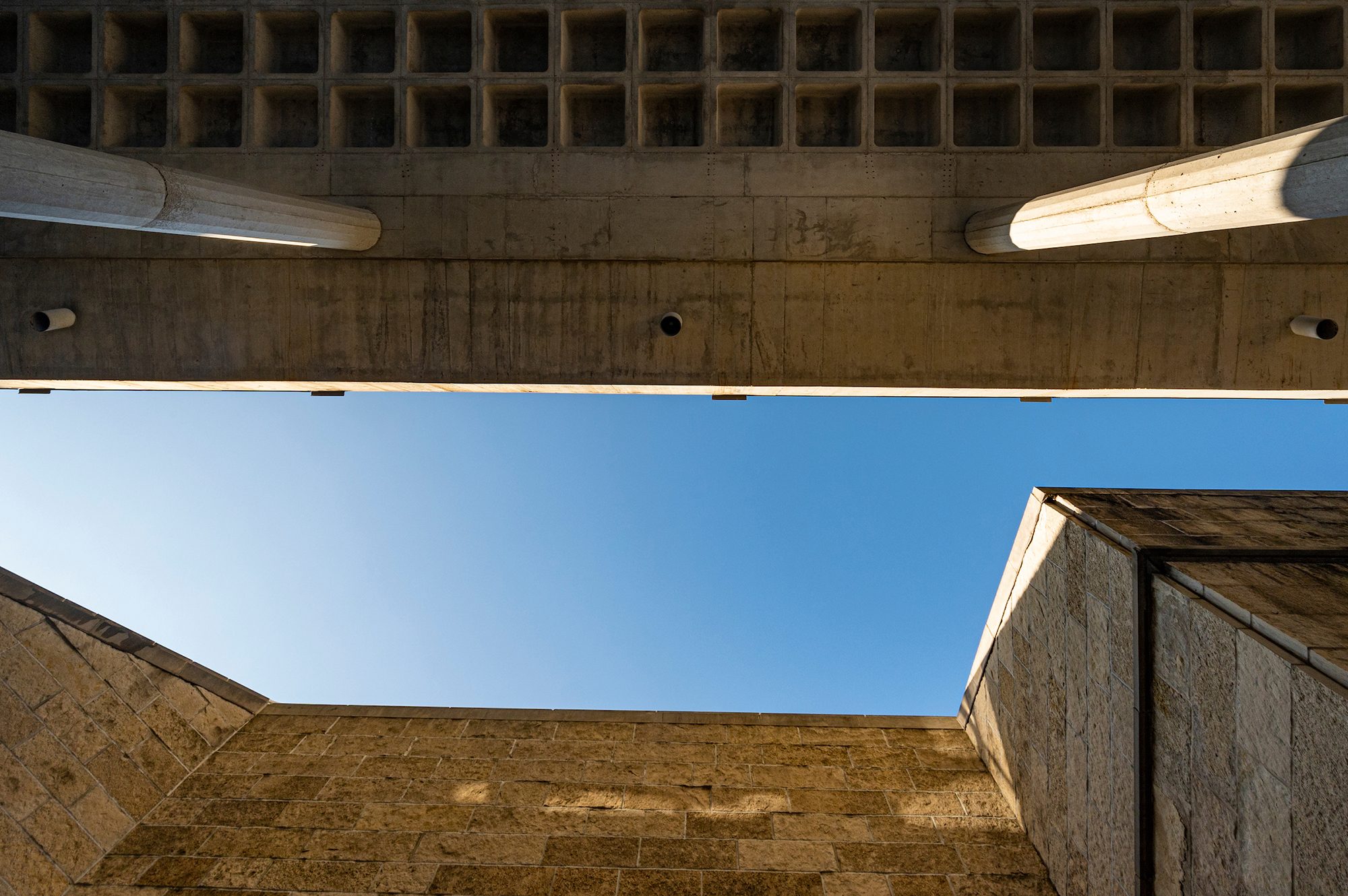
The terrace level below — largely open to the elements — offers a plaza with raised pedestrian walkways. Waffle slab meets the eyes above, while protruding columns frame the surrounding landscape. The space “create[s] the flavor of an old European walled city,” the UW’s alumni magazine wrote in 1979.
Set into this middle layer are the largest lecture hall, the primary performance space (Mills Concert Hall), and a tier of offices wrapped with a curtain wall of copper-clad vertical windows. The concrete-heavy exterior attempts to match the hues of the Historical Society.
Twenty-some entrances recede from obvious view, creating a compelling series of solids and voids. A pedestrian bridge links the building to Bascom Hill over Park Street, affording access at multiple grades. (A second bridge, over University Avenue, was removed in 2015 after deterioration and decline in use.)
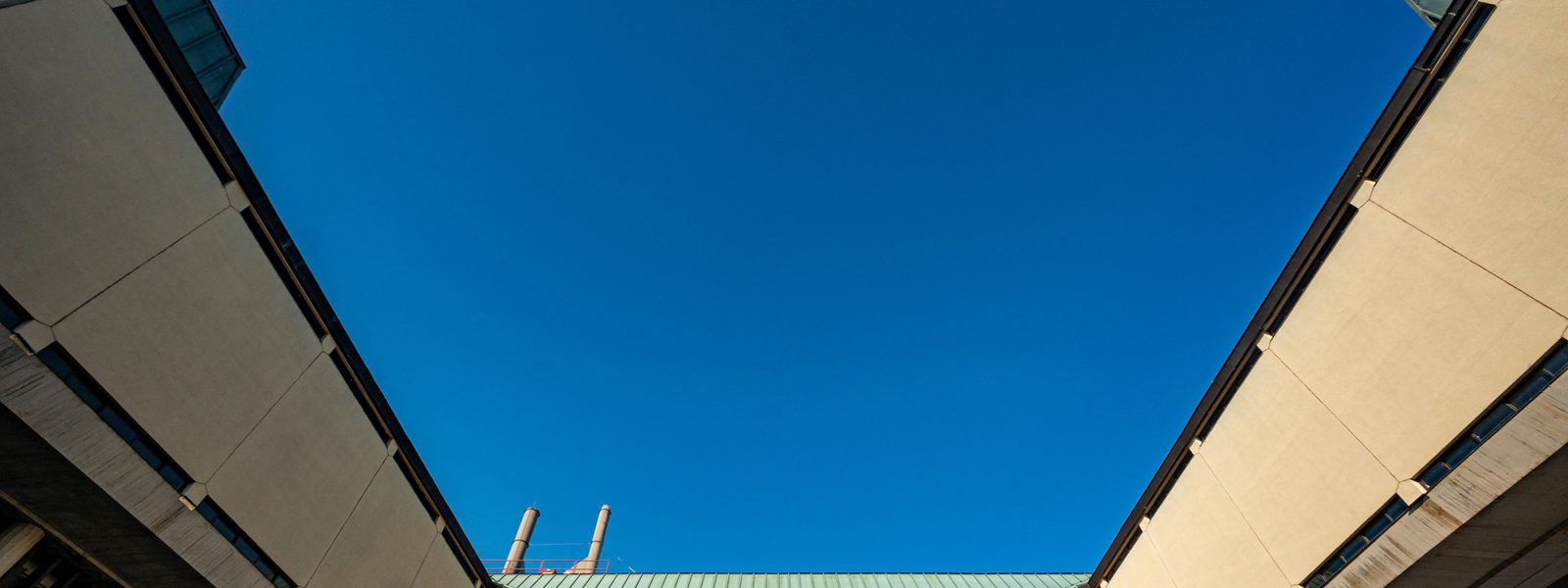
The bottom layer houses two levels of classrooms. Its exterior walls, covered in limestone panels and set with skylights, slope to merge with the base of the columns — an attempt to softly transition the mammoth structure to the ground below.
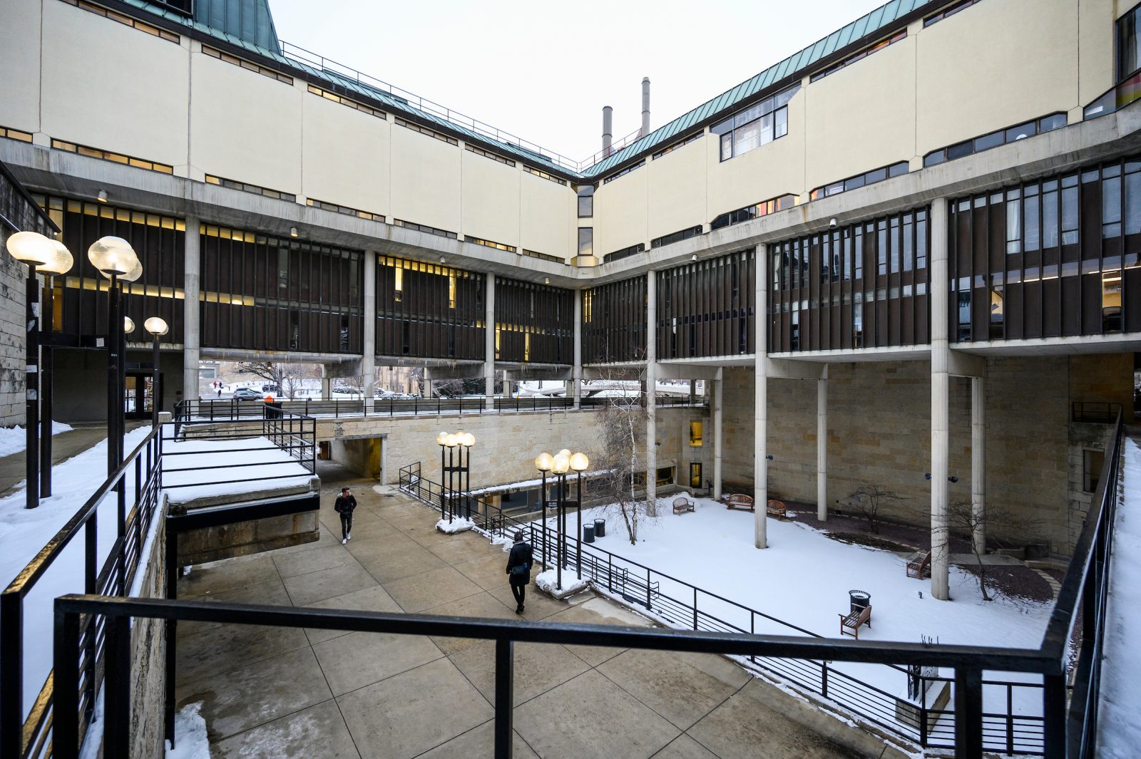
From a distance, Bruegmann notes, one can see parallels to a Greek temple: the nearly symmetrical build with a solid base, columnar body, and striking cornice. At the center of the complex lies a medieval European touch: a courtyard.
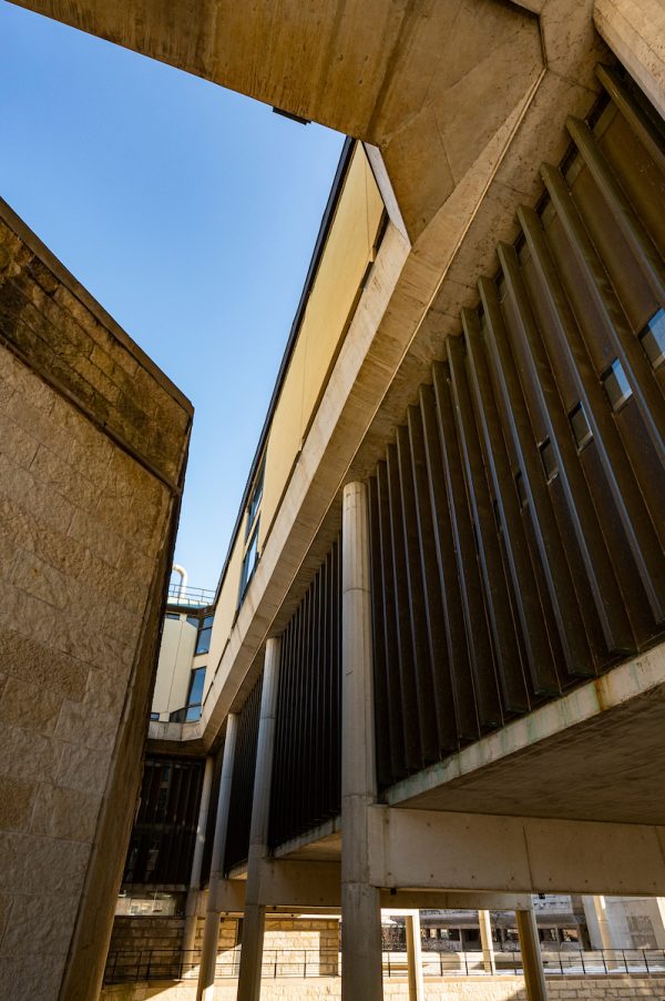
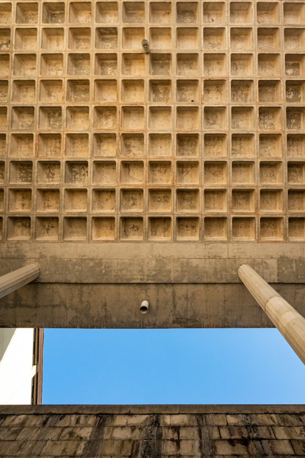
Despite the modern design and classical nuances, the concrete tends to dominate everything. Brutalist would seem a fitting description even if it weren’t the name of the popular architectural style of the time. “[Weese] did everything that he possibly could to make that building fit in,” Bruegmann says today. “And I think the reason it has gotten such bad press is more about the [functionality]. The program was just too much. It’s just too big for the site.”
Nearly a decade elapsed between the building’s design and completion, and the world had changed. Unrest from the Vietnam War extended to architectural taste. Monumental buildings represented institutional tyranny. New buildings became smaller and simpler, making Humanities a target of criticism. “By the time it was finished, it looked very much like it was from some previous era,” Bruegmann says.
But what dooms the building today isn’t the imposing design — it’s the lack of functionality. And a tight budget may have doomed it from the very start.
The Cuts
The UW Orchestra and Pro Arte Quartet serenaded hundreds of visitors during a full week of dedication events for the Humanities Building in November 1969. UW vice president Robert Clodius toasted its “beauty, harmony, and grace.” But the music had none of those virtues. The dreadful acoustics, which made volume control a challenge, proved an early sign of trouble to come.
When construction bids arrived in 1966, the building, originally planned for occupancy in fall 1967, was already significantly delayed. Worse yet, the lowest bidder came in $1.9 million over budget.
The state balked at redesigning and rebidding the project, as the winning contractor, Corbetta Construction Company, indicated it would not bid again.
“The state said, ‘Oh well, just build it for whatever money you have. It only needs to last 30 years,’ ” says Gary Brown ’84, the UW’s director of campus planning and landscape architecture.
The university, state, and architect engaged in rounds of cost-cutting proposals.
Simplifications included removing decorative stone from the entrances, omitting snow-melting systems, scaling back acoustic treatments, and leaving interior concrete surfaces bare rather than plastered. The central courtyard, conceived as a joyous gathering space with a large reflecting pool, turned into a gravel pit.
It’s likely the budget also affected materials. “We have single-pane windows; we have uninsulated metal panels; we have thin concrete walls so that rebar is blowing the stone and the concrete off,” Brown says. “It was all built very economically.”
Humanities nearly lost its softest feature, the limestone. Substituting brick could have saved the university some $350,000, but administrators felt pressure to keep the Wisconsin stone rather than the “Ohio brick.” C. A. Engman, the UW’s vice president for administration, feared brick “would detract a lot from what will perhaps be the last of our ‘monumental’ buildings on the Madison campus.” He helped to secure the additional funding.
How might a fully funded Humanities have looked? The Elvehjem Art Center (now part of the Chazen Museum) holds some clues. Weese designed it in conjunction with Humanities, but private funding spared it from similar cuts. With a friendlier stone-to-concrete ratio and a smaller footprint, the building has fared better critically.
“I always tell people, ‘Look, it’s a really cool piece of architecture, but it doesn’t function,’ ” Brown says of Humanities. “And it really hasn’t functioned from day one.”
The Problems
“One doctor … thought the building would literally kill me.”
In an explosive 1996 Capital Times story, faculty members in the art department vented about the Humanities Building. They linked the toxic chemicals emitted from welding, printmaking, and painting to health issues such as asthma. And they blamed the building’s inadequate ventilation system (and the inability to open most windows).
Although complaints about ventilation dated to the 1970s, the university’s periodic air-quality tests met the required standards. Under growing pressure, including claims for workers’ compensation, the university and state put forward $4.5 million to renovate the ventilation system and reconfigure the art department.
Other issues have persisted throughout the life of the building.
The horizontal roof has always leaked. Within five years of opening, the building needed significant waterproofing repairs. By the 1980s, such issues had become a running joke at the State Building Commission.
The concrete is crumbling. Uninsulated concrete, combined with spotty heating and cooling inside, leads to frequent freeze-and-thaw cycles and further deterioration.
The building is an energy hog. The top layer’s in-floor radiant heating, designed to offset the exposed concrete, failed in the 1970s. It was never fixed. The sheet-glass windows form frost in winter, which leads to water damage in spring. The university has to pump in extra humidity in the winter to protect pianos and wind instruments in the basement, but that only compounds the frost buildup.
In between Band-Aid fixes, the university has explored large-scale solutions. In 2016, the UW hired an architectural consulting firm, Inspec, to assess the building and provide estimates for making it functional and code compliant.
The firm recommended wholesale renovations to the building’s envelope — insulating the exposed slabs, installing new floor heating, repairing concrete and columns throughout, replacing the roof and windows, rebuilding stairs and railings. The estimate was $22 million, plus an additional $12 million for other maintenance issues and aesthetic upgrades.
The art and music programs have already split into other buildings, and the intensely customized interior would be difficult to reprogram without gutting it. “Do you make the little practice rooms into offices? I’m not sure I’d want to be in one of those windowless rooms down in the basement,” Brown says.
The Promise
It’s hard not to yearn for what might have been.
Writing for Preservationist Magazine, former art history student Anne Matthews ’78 noted about Humanities: “even when you felt most lost, most trapped, you never forgot you were wandering inside a gigantic work of art.”
To Bruegmann, the building symbolizes a hopeful period of history and architecture. Amid a middle-class boom, postwar architects like Weese held a deep sense of civic duty. “He would tell us about how he was going to change the world one city at a time,” his daughter Marcia told Chicago Magazine in 2010.
Despite its name and appearance, Brutalism was an inherently optimistic style, harnessing concrete’s newer capabilities and fulfilling society’s greater investment in public-works projects. Its core tenet was “honesty in structure and material,” wrote Reyner Banham, the leading historian of Brutalism. It hid nothing — not even the marks where wooden framework once guided the poured concrete. It saw morality in exhibiting exactly how a building is built and how it stands.
Weese might have despaired at Humanities’ demise. A rarity for architects of his generation, he was an avid preservationist, coining the phrase “every building is a landmark until proven otherwise.” He died in 1998, a flawed man and overlooked architect who became bitter toward the end. The final words in his journal: “I’m okay — the world’s all wrong.”
The Future
Completion of the state-of-the-art Hamel Music Center in 2019 was the first step to clearing out Humanities. It gives the Mead Witter School of Music a new home for performances and rehearsals, and there are plans for an additional academic building to accommodate the music program. Next on the list is a new College of Letters & Science academic building, which will provide administrative and classroom space for the history department and dozens of other units. A new parking facility near the Kohl Center will allow the Art Studio Lab to expand over an existing lot, providing more room for the art department.
The university hopes to secure funding and complete these projects by August 2029. The demolition of Humanities is to follow. Two smaller academic facilities with underground parking would likely go on the site — a tower by University Avenue and, in a nod to Weese’s height control, a shorter one by Bascom Mall.
A long line of chancellors has backed the plan for removal, including John Wiley MS’65, PhD’68, who wanted to be “the first person to swing a sledgehammer” at Humanities.
Before then, it’s worth appreciating some parts of Weese’s vision.
Head down Bascom Hill, over the pedestrian bridge, enjoying the curated view of the state capitol and the blending colors of Humanities and its neighbors. Continue leisurely through the outdoor plaza, letting your mind drift to a European streetscape as the concrete pillars frame a view of the Music Hall clock tower. Descend to the arbored courtyard and relax on a bench.
On such a stroll, even the toughest Humanities critics might admit it’s not all bad. •
